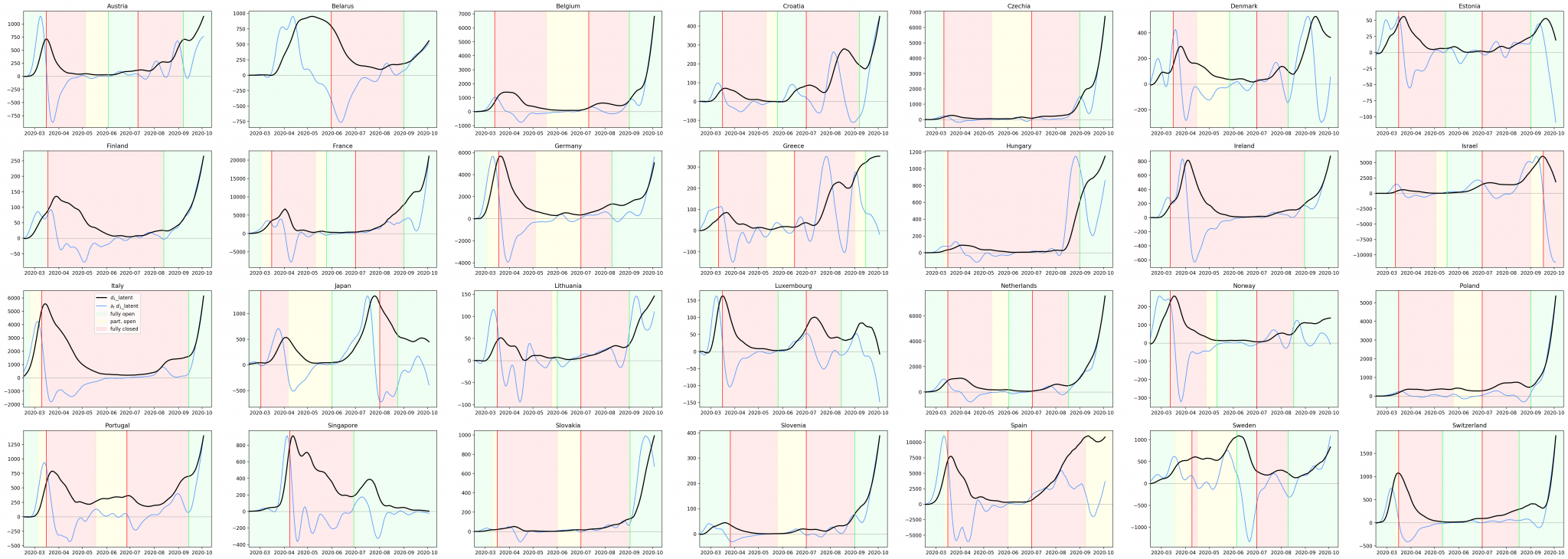
The analysis combines the data of diagnosed cases of disease around the world (data from CSSE John Hopins University, https://github.com/CSSEGISandData/COVID-19) with information on school openings and closings (https://unesco.org).
We draw the daily numbers of identified cases, smoothed with the Savitzky-Golay filter for the sake of clarity. In order to have an insight into the dynamics of infections, the data was shifted by 10 days – according to our estimates, this is roughly the amount of time that passes from the moment of infection until the case is identified and shown in the statistics. Additionally, we draw a derivative, i.e. the difference from day to day, of above-mentioned smoothed curve. Values greater than 0 mean increases, less than 0 – decreases. We use colors to denote the opening status of schools (open / partially open / closed).
We have selected 28 countries, mainly from Europe, for which you can see school openings and / or closings that can be analyzed.
Download the chart in full resolution
Similar trends can be seen in most countries. After the first lockdowns in March (and shutdown of everything, including schools), cases are rapidly shrinking. On the other hand, summer vacations and the practical lack of restrictions cause a new increase, although schools are closed. After the summer holidays, despite the already ongoing increases, most countries are opening schools, which further accelerates the growth.
The above analysis does not examine a wide list of social dependencies related to schools (parents’ absence from work, commuting, contacts with peers, changes in public transport, etc.) and differences at the country level, it only indicates a high coincidence of the opening of institutions and the increase in infections.