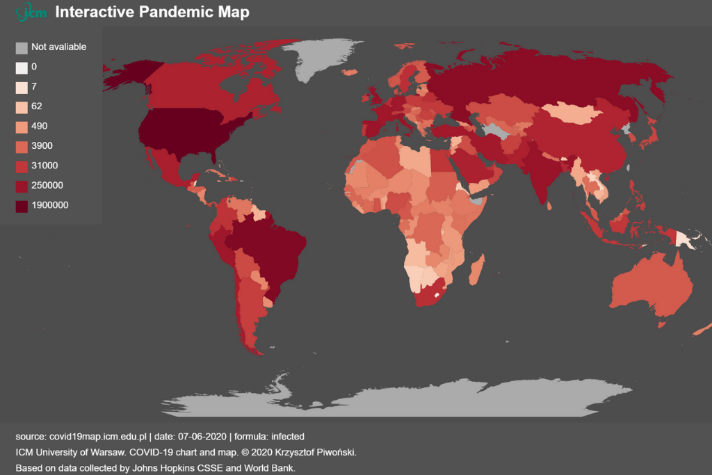
The ICM Interactive Pandemic Map made it possible to compare epidemiological data in relation to population size, country wealth, population density or health care quality. This was possible thanks to integration with demographic data provided by the World Bank.
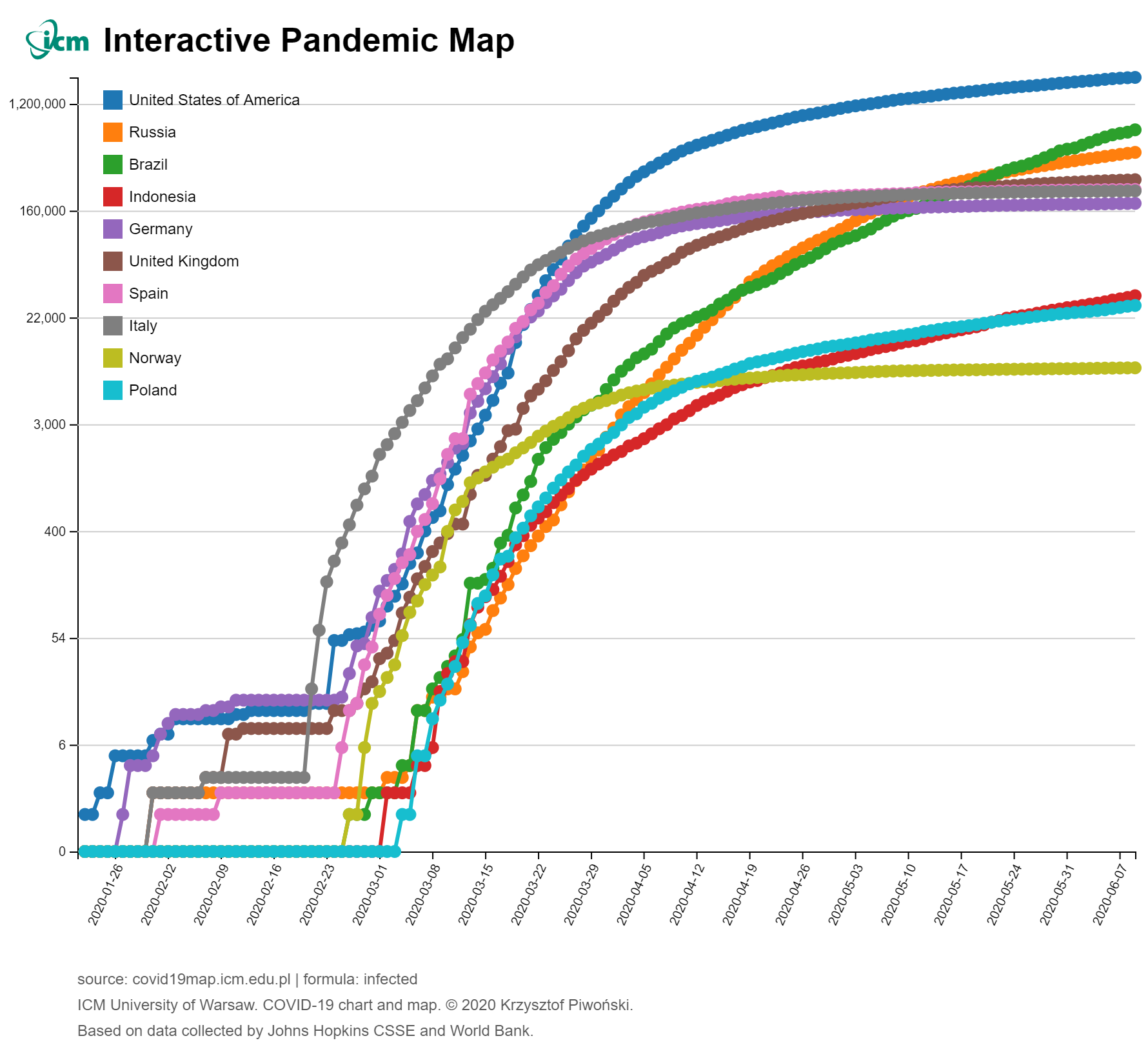
The application allowed comparing the epidemiological situation between countries. The data was presented in the form of interactive maps and charts. The user could compare basic indicators such as the number of infected, deaths and recovered, as well as more advanced indicators such as mortality or the number of infected people per million. The model was supplied with data from the Johns Hopkins CSSE.
The creator of the Covid-19 interactive map was Krzysztof Piwonski of the SESAR project team at ICM UW, which implements innovations in the area of air traffic management.
The application was operational during the peak of the Covid-19 pandemic.