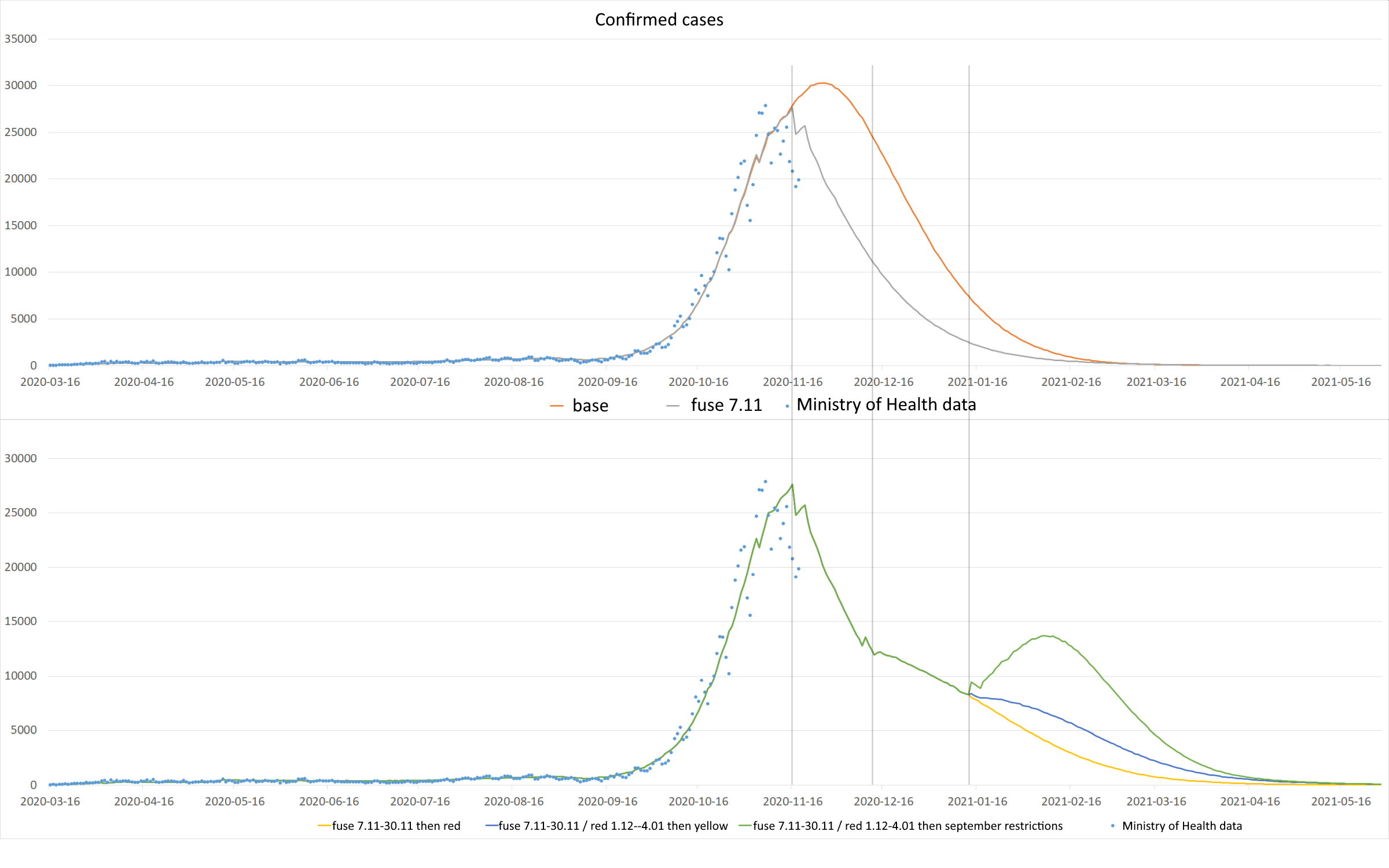
The analysis below concerns variants of the spreading of the epidemic for the forecast from 9/11. The base course includes the introduction of the red zone throughout the country on 10/26.
Observation data is updated to 18/11. The analysis does not take into account the currently considered variants of administrative restrictions (such as winter holidays until 01/17 for the whole country or the opening of shopping malls in the pre-Christmas period).
The presented variants relate to the following changes to administrative restrictions:
– Upper Chart: Baseline Waveform
– Upper chart: Basic waveform from the so-called with the fuse inserted 11/07
– Bottom chart: Basic waveform with a fuse and return to the red zone 11/30
– Bottom chart: Basic waveform with a fuse, return to the red zone on 11/30 and then to the yellow zone on 1/04
– Bottom chart: Basic waveform with a fuse, return to the red zone on 11/30 and a return to September restrictions on 1/04

Download the chart in full resolution
In the upper graph, the first waveform change appears on 11/16, when the number of detected cases at the “fuse” begins to decrease, compared to the base waveform. This is a visible effect of introducing restrictions and is consistent with the observed data.
The waveforms of the base waveform and the fuse curve are so “classic” that they do not require additional analysis. In accordance with the adopted modeling assumptions, the number of identified cases will decline rapidly after crossing “the hill” and achieving herd immunity. In this variant, the fuse is not removed, which is a purely model assumption.
On the other hand, in the lower chart, the interesting “curve junction” takes place on 12/09 – 10 days from removing the fuse and returning the whole country to the red zone. Then we observe a slowdown in the decrease in the number of cases found. It seems obvious – the model assumes (and it is in line with what we actually observe) that approximately 10 days after the easing of restrictions, we will record an increase in the number of cases reported.
On January 12 and 13 you can see the greatest divergence of the curves, depending on the selected variant (bottom chart).
Depending on whether the restrictions return to the yellow zone level on January 4 or to the September restrictions (including the opening of schools), we observe differences in the rate of decline in the number of new cases. The most “dramatic” course is the variant back to the September restrictions – the opening of schools causes a sudden increase.
Of course, the above analysis of the courses does not take into account the wide range of possible social behaviors, hygiene habits acquired during the pandemic (which can naturally slow down the spread of the epidemic) or other, not yet implemented solutions, such as hybrid teaching in grades 1-3 or the requirement to wear masks in school and no class changes or isolation of people from groups that are most at risk of contracting the infection and the severe course of the disease.
Below are the waveforms for the number of people currently hospitalized and in the ICU (i.e. active use of a ventilator). As can be seen in the graphs below, the actual numbers of hospitalized and ICU patients run below the modeled curves. This is due to the fact that the model was calibrated to the numbers observed when the health service had an excess of beds and covid respirators.

Download the chart in full resolution

Download the chart in full resolution
In the analysis of the course of various variants of lifting administrative restrictions, the number of deaths is an important value. For the analyzed waveforms, they are as follows:
– Base Waveform (BW): 95,000
– BW + fuse: 63,000
– BW + fuse + red 11/30: 80,000
– BW + fuse + red 11/30 + yellow 1/04: 88 000
– BW + fuse + red 11/30 + September restrictions 1/04: 107,000
Deaths are straightforward from the model and calibrated to actual data reported in official sources, which may not include all deaths actually caused by Covid-19. Calibration is performed when the forecast is prepared.
The chart below presents a cumulative chart of daily deaths depending on the chosen option of lifting the restrictions.
